
Card gallery
Integrations return plain data in these shapes and the page draws them. A new kind of display is one new card type, and then every integration and the assistant can use it. See cards for the idea.
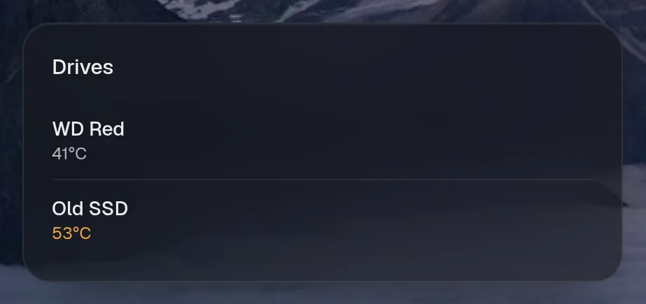
Everything here is the real renderer, drawn from src/web/samples.ts, the same samples the tests check.
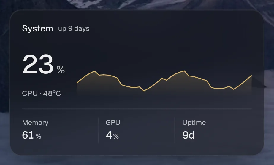 Stats
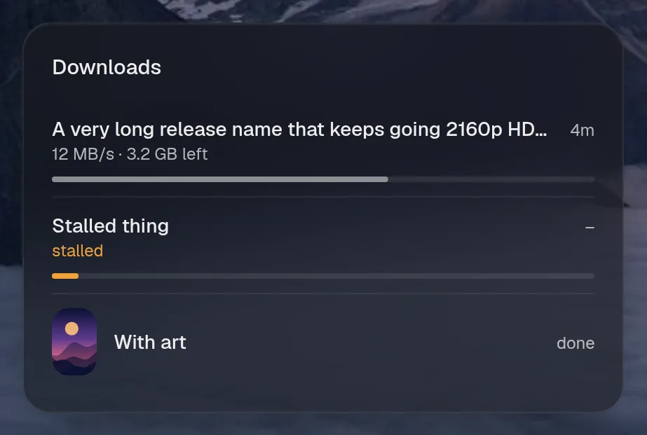 List
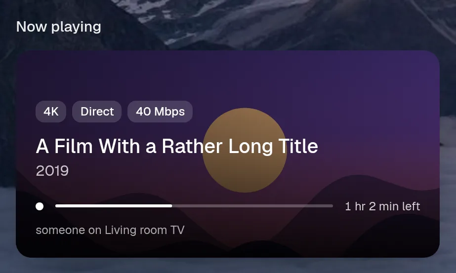 Media
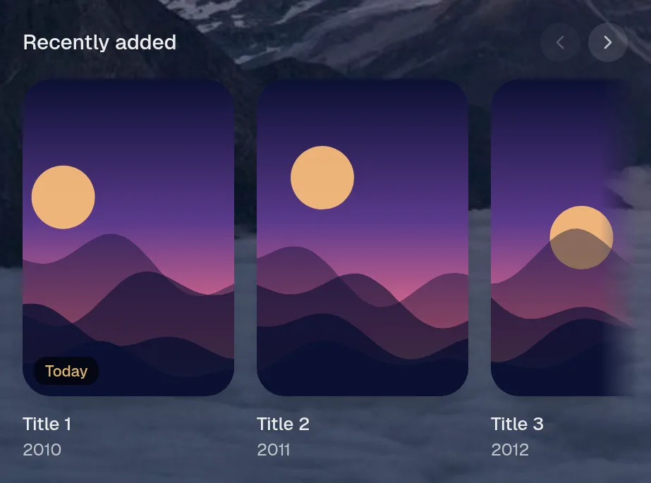 Shelf
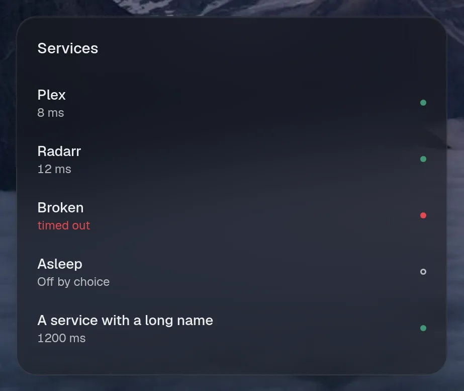 Status
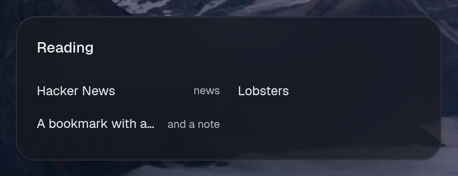 Links
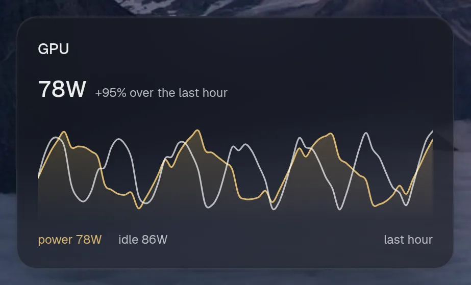 Chart
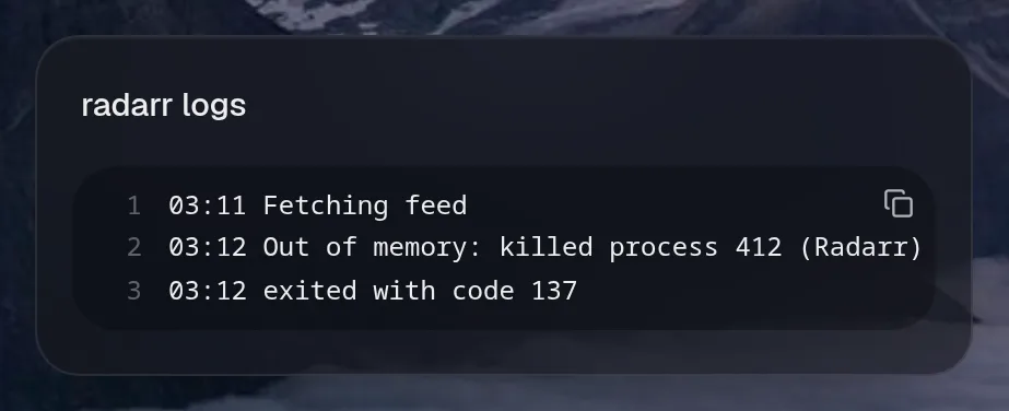 Code
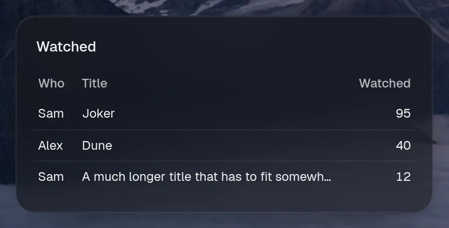 Table
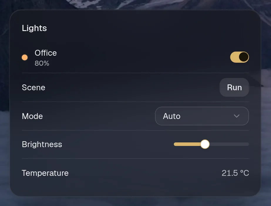 Controls
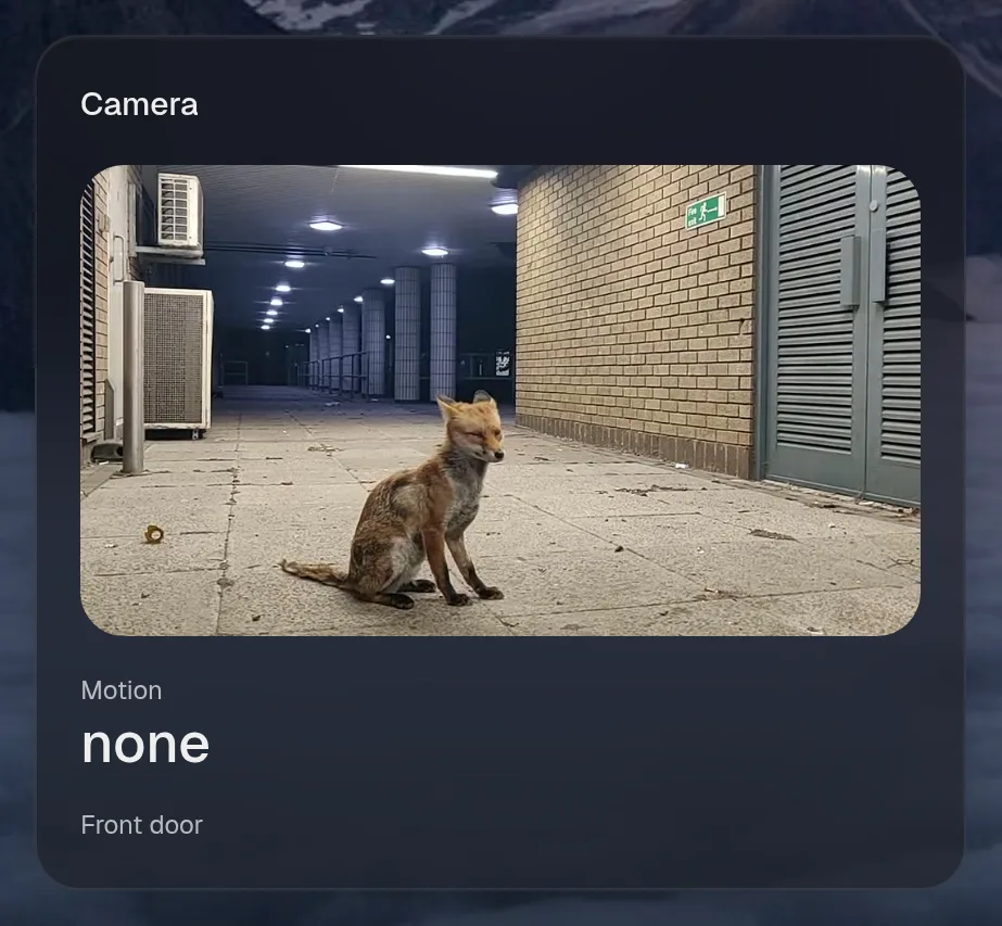 Showcase
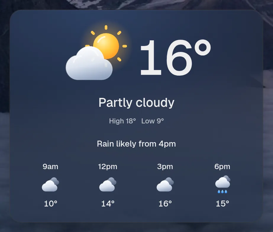 Forecast
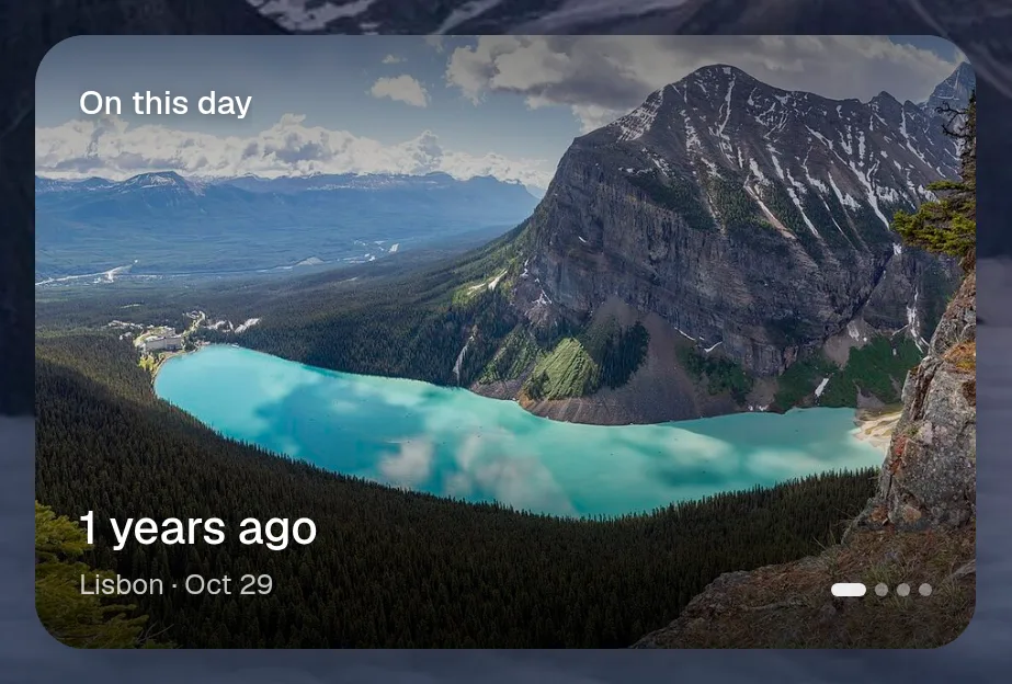 Photos
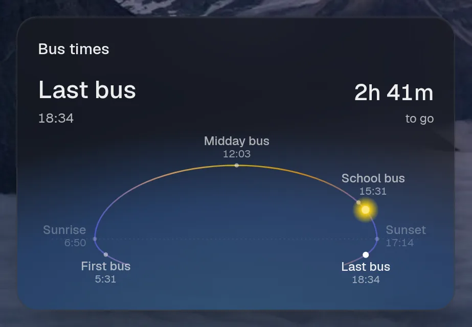 Schedule
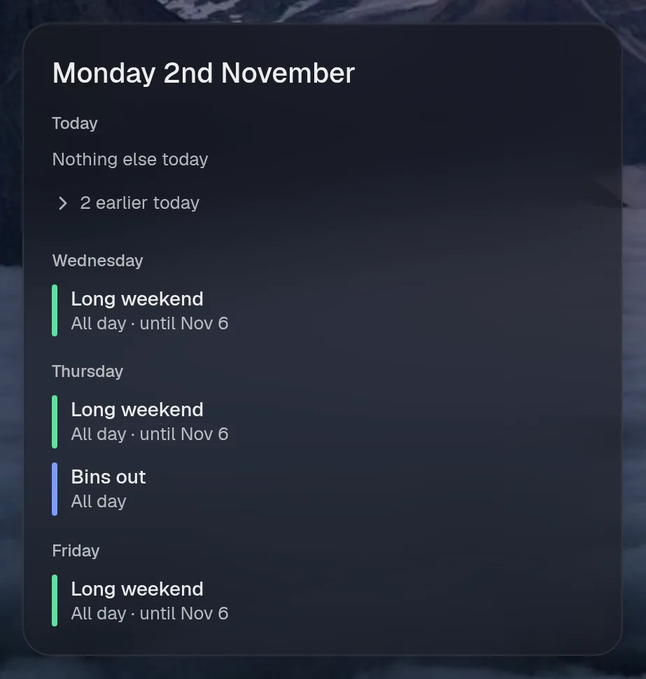 Calendar
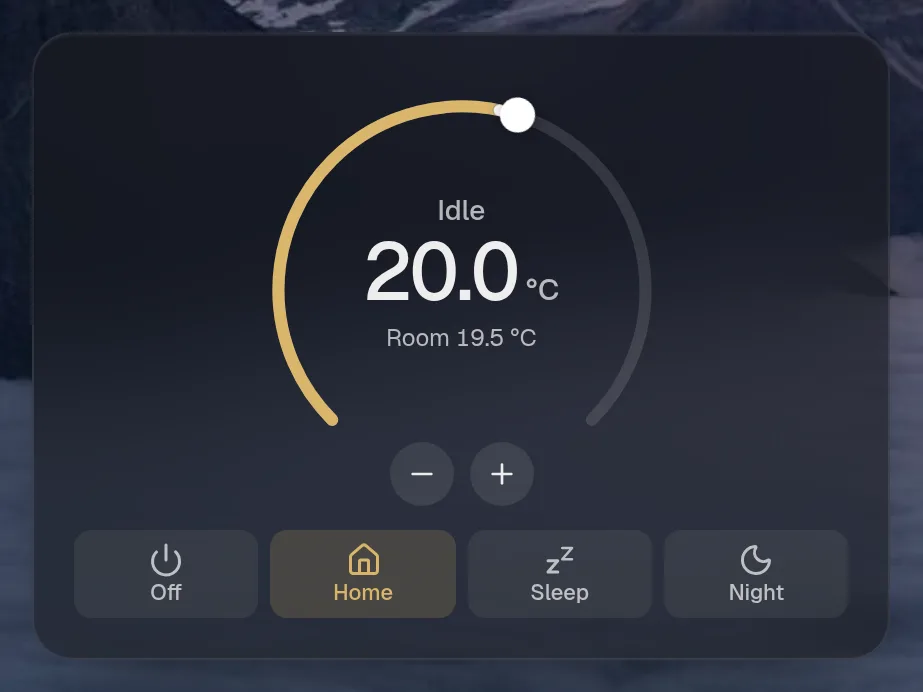 Thermostat
- Article
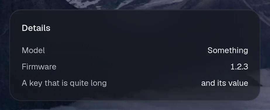 Key-value
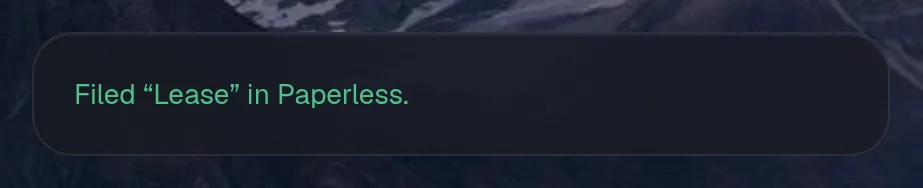 Text
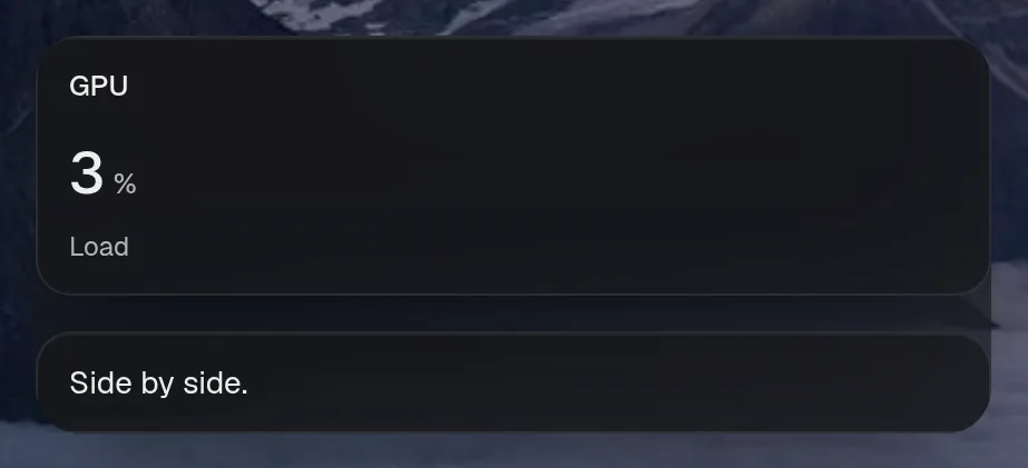 Group
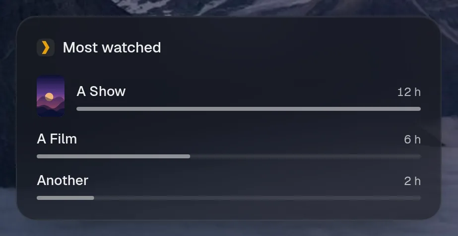 Ranked
 Embed
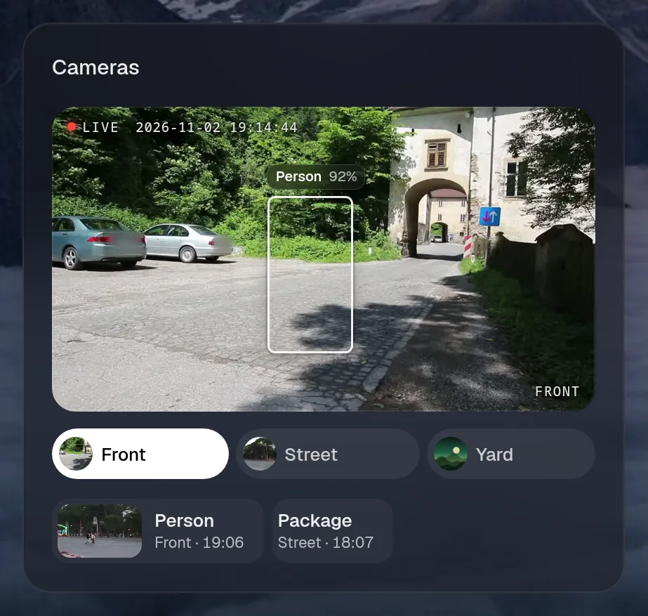 Cameras
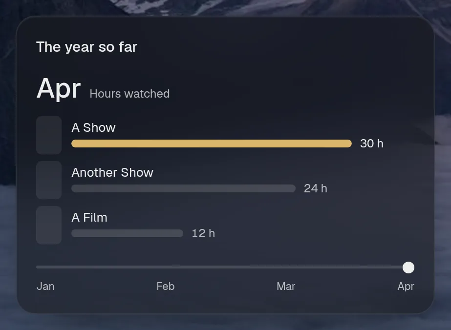 Race
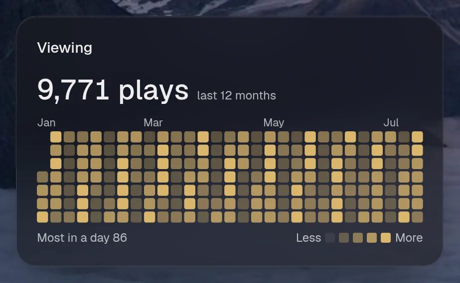 Heatmap
 Tiles and rings
Fields all cards share
Section titled “Fields all cards share”| Field | Type | What it does |
|---|---|---|
source? | { name: string; icon?: string } | where this comes from, shown beside the title: Plex, Seerr, RomM… |
title? | string | |
icon? | string | icon name from the built-in set, or a URL |
href? | string | “open the app” link |
note? | string | small text in the card header, e.g. ”↓ 4 MB/s” |
summary? | Summary | |
summaries? | Summary[] | several headline tiles from one card (e.g. CPU, memory, network, each disk) |
wide? | boolean | take two columns (and two rows) on wide screens |
activity? | Activity | set only while something’s live |
buttons? | { label: string; action: string; args?: Record<string, unknown> }[] | quick actions along the bottom |
banner? | Banner | a state the person chose and should not forget, at the top of the card |
Banner
Section titled “Banner”“Blocking paused until 14:05”, with the way out beside it. until (ms) is written in the viewer’s own clock.
| Field | Type | What it does |
|---|---|---|
text | string | |
until? | number | |
tone? | Tone | |
button? | { label: string; action: string; args?: Record<string, unknown> } |
Activity
Section titled “Activity”Something happening right now, for the rings at the top of the page: a stream, a download, a robot cleaning. A card carries one only while it’s live; the rings show the live ones in the order the config lists them.
| Field | Type | What it does |
|---|---|---|
title | string | |
subtitle? | string | |
image? | string | artwork; otherwise icon |
icon? | string | |
pct? | number | 0..1 progress |
trailing? | string | short text on the right, e.g. “34m left” |
tone? | Tone | |
count? | number | more of the same (e.g. 3 streams) |
paused? | boolean |